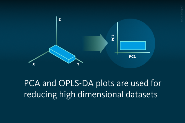
A routine lipidomics experiment may involve the analysis of the lipid composition for a treatment and a control group, and the result of this experiment is a data table with hundreds of lipids measured. What are the options to find out if there are any changes between the control and treatment groups? Typically, scientists use Principal Component Analysis (PCA) score plot to turn hundreds of measured lipids into a usually two-dimensional dataset that covers most of the variability inside the dataset without considering the groups. This enables the researcher to get a first impression of how the data are distributed.
In the examples below only four different lipids were measured, two phosphatidylserine (PS) species and two phosphatidylethanolamine (PE) species. In the first example (“non-effect example”), no systematic differences between the two groups for any of the lipids measured are present. The second example contains a systematic change of the PE 18:0;0_18:1;0 lipid (“effect example”).
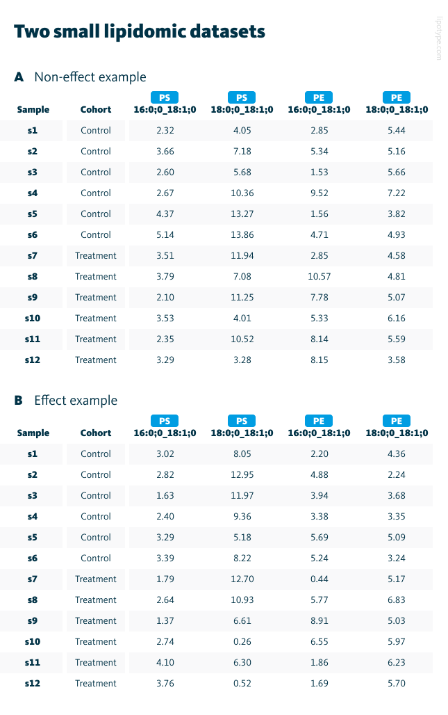
Two small lipidomic datasets. A “Non-effect example” and B “Effect example”.
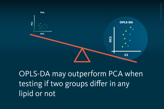
The PCA score plots show the major variance. Nevertheless, both plots show a big overlap between the control and treatment groups. This is not satisfying as there are systematic changes in PE 18:0;0_18:1;0 in the effect example. In this case, the ‘Effect example’ dataset was designed specifically to include the differences, therefore the PCA representation of this dataset is not optimal to visualize the group differences. Here, in this particular lipidomics example, OPLS-DA outperforms PCA.
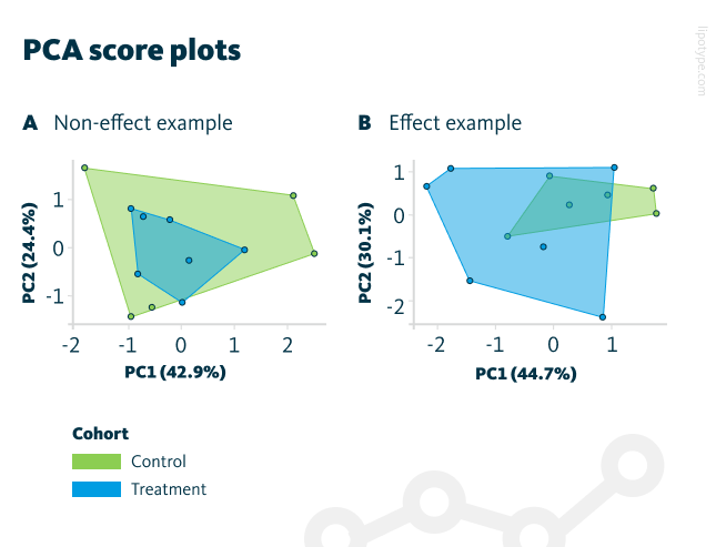
PCA score plots show the first two principal components containing most of the variance. The control and treatment groups for both examples (A and B) overlap.
Like PCA, orthogonal partial least squares discriminant analysis (OPLS-DA) is a method that graphically visualizes possible lipidomic differences between two groups of samples. Further, it extracts the driver lipids for the segregation and provides information about the stability of the results by performing a permutation test. (Permutation tests check, whether a possible segregation reached in an OPLS-DA score plot is trustworthy or not.)
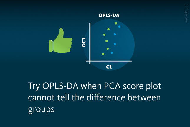
OPLS-DA plots are also used for reducing a high dimensional dataset. However, in contrast to PCA, the OPLS-DA plot covers most of the variability between the two groups (e.g. control vs. treatment) on the x-axis and most of the variability within the groups (“inner-group variance”) on the y-axis.
The component on the x-axis C1, or component 1, is important for the segregation of the cohorts is. C1 tries to best segregate between the two groups ‘control’ and ‘treatment’, it maximizes the variance between the two groups. The orthogonal component (OC1) on the y-axis is uncorrelated to C1 and maximizes the variance within the groups and shows how much the samples of a group differ. OPLS-DA score plots reveal on the x-axis the component C1 best segregating the two groups; on the y-axis the component OC1 maximizes the inner-group variance uncorrelated to C1.
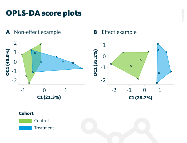
The OPLS-DA score plots show the first two principal components containing most of the variance. A The control and treatment group overlap for the “non-effect example”. B For the “effect example”, the control and treatment group are properly separated.
The OPLS-DA score plots highlights that the data structure for the “No-effect example” does not contain differences – the cohorts are still overlapping on the graph, which is reasonable because there are no systematic changes in the lipidome between both groups. In contrast, the “Effect example” contains systematic changes in the lipidome between the groups and these are displayed in the plot.

It is also possible to determinate the lipids that are the lipids responsible for groups differentiation. OPLS-DA loadings plots are used to find out and visualize the main drivers for separation between groups. In a lipidomics context, “main drivers” means the lipids causing the main differences between the control and treatment group. The OPLS-DA loadings plots reveal also the main driver of component C1. In the effect example, PE 18:0;0_18:1;0 has a value of 0.9, whereas the other lipids have values only slightly differing from 0.
That means, PE 18:0;0_18:1;0 is (correctly) responsible for the segregation of the control and treatment group. Performing a permutation test (randomly reassigning the cohort membership multiple times and trying to best separate the groups) leads to a p-value of 0.32 for the non-effect example and 0.03 for the effect example. That means, the segregation reached by the OPLS-DA score plot is significant and can be seen as stable for the effect example in contrast to the non-effect example.

OPLS-DA loadings plots. A Component C1 is mainly dominated by PE 16:0;0_18:1;0 in the “Non-effect example”. B For the “Effect example”, PE 18:0;0_18:1;0 with a value of 0.9 has the largest impact on C1, which is reasonable because the mean value of this lipid changes systematically between the groups. Component OC1 instead is mostly dominated by the PS lipids.
In some scenarios, there may be a stark difference in the OPLS-DA score plot on the x-axis (C1) between the control and treatment group, but the permutation test reveals the segregation was caused by randomness. In other words: the permutation test aims to ensure that the segregation reached in the OPLS-DA score plot is stable and therefore trustworthy.
Finally, it is worth mentioning, that both PCA and OPLS-DA require full datasets, meaning that missing values are not allowed to be in datasets in such cases. It may be required to apply data imputation to these datasets. Enrichment analysis can also be done using as input the results of the WGCNA or OPLS-DA, i.e. you do the enrichment on the significant lipid modules identified WGCNA, or on the most important lipids identified by OPLS-DA.
To conclude, OPLS-DA can graphically show if there is a difference in the lipidome between the two cohorts. It also extracts the driver lipids of the segregation achieved and the permutation test provides information on how stable the segregation is. OPLS-DA was developed to find differences between two groups (e.g. control vs. treatment); for comparing groups, OPLS-DA is always better suited than PCA. For research objectives other than comparing groups, PCA may be a better lipidomics data analysis approach than OPLS-DA.
Lipotype Lipidomics technology offers a comprehensive lipid analysis for customers who are looking to gain in-depth insights into lipid metabolism, which plays a crucial role in both health and disease states.
Need clarity on the process?
Ask us anything!

Lipotype products are provided for Research Use Only. They are not intended for clinical diagnostic purposes and must not be used to inform medical treatment decisions. The content of this article is for scientific and educational purposes only and should not be considered medical advice.


